ADDING FEATURES

ROLE

UX/UI Designer, UX Researcher

ROLE

UX/UI Designer, UX Researcher

ROLE

UX/UI Designer, UX Researcher

TIMELINE

June 2024 - July 2024

TIMELINE

June 2024 - July 2024

TIMELINE

June 2024 - July 2024

Background & Problem

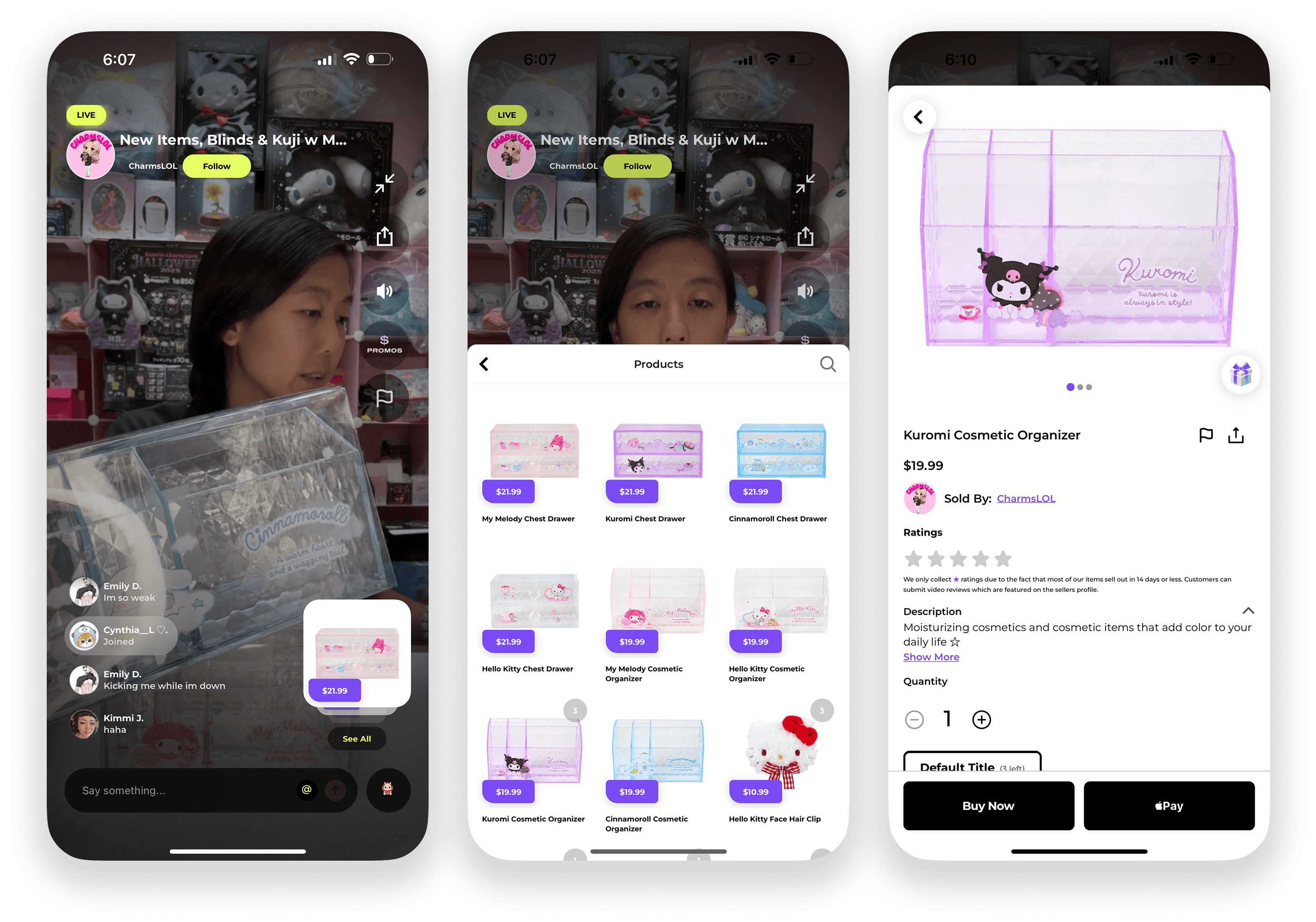
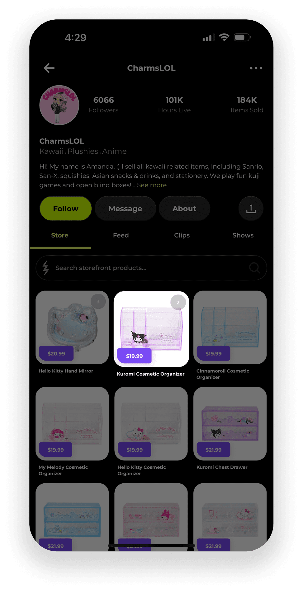
Popshop Live (PSL) is an emerging livestream e-commerce platform that merges social interaction with online shopping, allowing sellers to showcase products in real-time while engaging directly with viewers. The platform caters to small businesses and creators, fostering a unique space for them to connect with consumers in a more personal and immersive way. However, Popshop Live lacks design organization and user personalization which hinders its ability to fully leverage the potential of its interactive features.

Research

I conducted user research for Popshop Live to gain a deeper understanding of the platform's users (buyers) and to identify their needs, preferences, and pain points. With the rise of live stream shopping, it’s crucial to ensure that the platform meets buyer expectations and facilitates seamless interactions. Thus, I sought to gather insights that would guide me in defining a feature aimed at enhancing organization and increasing buyer satisfaction.

Objectives

To start my research, I created 4 main objectives as a guide to understanding buyer experiences in their purchasing journey. I focused on gathering insight on their personality, habits, and decision-making process.


  1. Explore user’s buying habits on live e-commerce platforms

  2. Determine how a personalized shopping experience affects user buying habits

  3. Understand what a user’s goal is in an e-commerce marketplace like Popshop Live

  4. Understand how users navigate the app when looking for a particular seller or item

Research Method

User interviews

User interviews were conducted over video call with 5 participants who have used streaming e-commerce platforms, 2 of those participants have used Popshop Live. Other platforms participants have used include Shopee, Whatnot, and Ebay Live.

  • A favoriting or save feature is common and expected across e-commerce sites, even live-stream ones

  • Live-streaming creates a sense of urgency for buyers to purchase items, thus buying habits tend to be more impulsive

  • Having the optimal exposure of suggested sellers vs. followed sellers

  • Transparency is always preferred when money is involved

Competitive analysis

Streaming e-commerce platforms are still rather niche, but I was able to compare PSL to two other platforms that use live video to sell products - Whatnot and Talkshoplive.

💡 So, what did I learn from my research?

  • Whether users are using PSL or not, they are accustomed to being able to bookmark interested items to refer back to later when they want to buy it. PSL lacks this feature, which users have complained that it makes it a hassle to find items they wanted to buy.


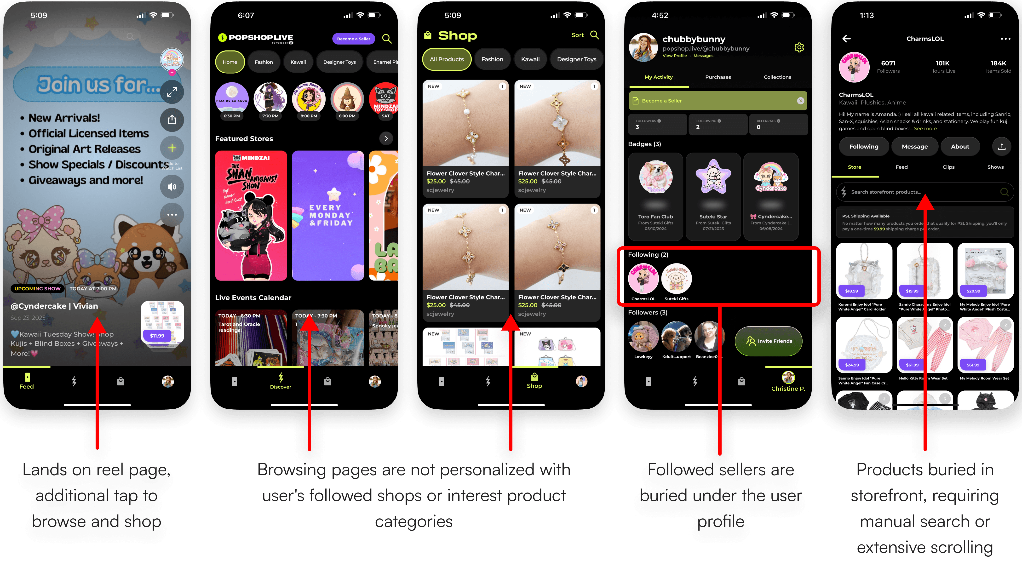
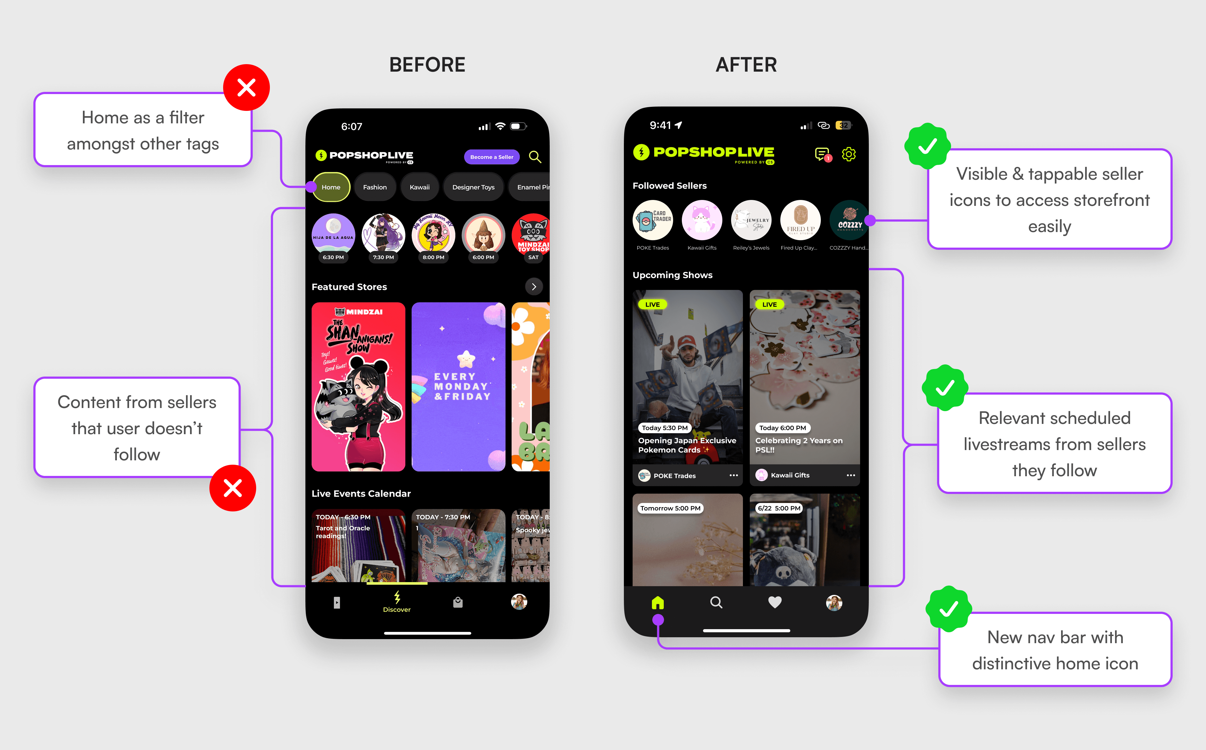
  • From a buyer’s standpoint, the organization of the app is rather messy and disorganized. Their home page is equivalent to a “discovery” page where all types of sellers are displayed to gain exposure. Users want to immediately see sellers they follow for easy access.t


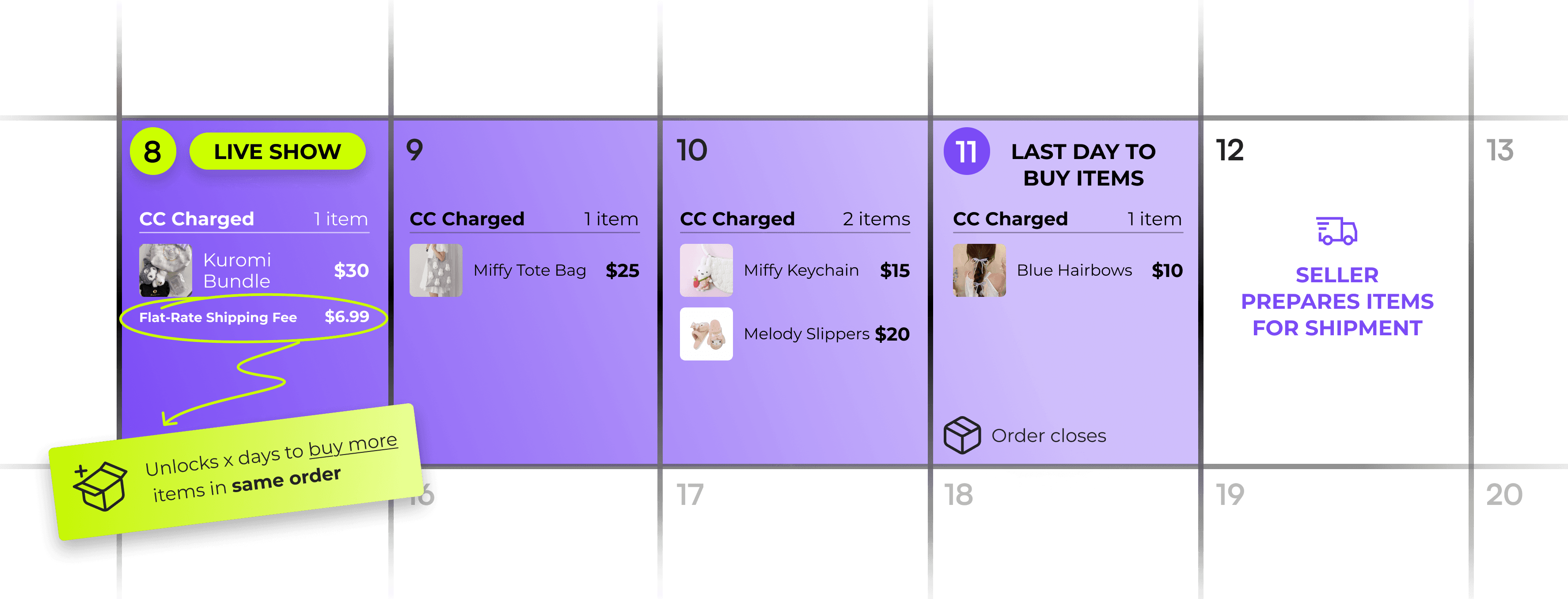
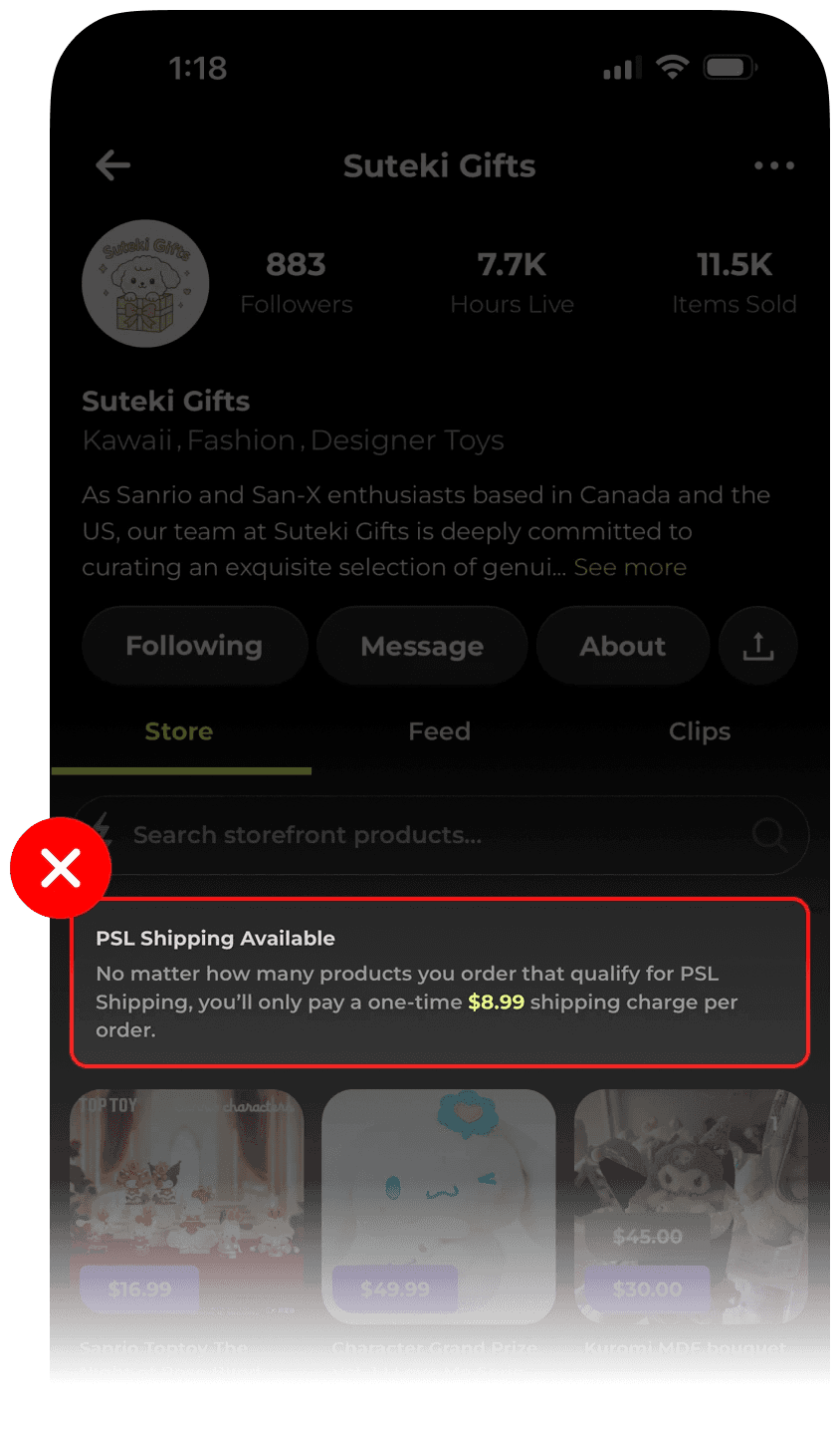
  • Once an item is purchased from a particular seller, free shipping is unlocked for any purchases after that for a time period set by the seller. While it is a nice feature to have as a user and a business, user’s find it frustrating having to calculate when that time period is up and their orders close. User’s say it causes some anxiety from the uncertainty and impacts their planning for purchasing things.

Define

Now with all the information I needed, I formulated how-might-we questions to focus on the main problems I wanted to solve. Due to limited time, I chose to go with two problems I wanted to tackle:


How might we make the PSL app feel more personalized for users who buy from sellers in the app?

How might we help users who have an open order on PSL figure out how much time is left before their orders close?

User Personas

As a way to step into the minds of PSL buyers, I created user personas to capture their characteristics and behavior. This helped with the ideation process in making sure what I’m trying to solve was pertinent to their problems.

Key Features

Happy customers are satisfied users who are able to find items that they want to buy and buy it successfully. Popshop Live’s timed open orders are a unique feature and is a great concept to urge people to buy more things.

Favorites Feature

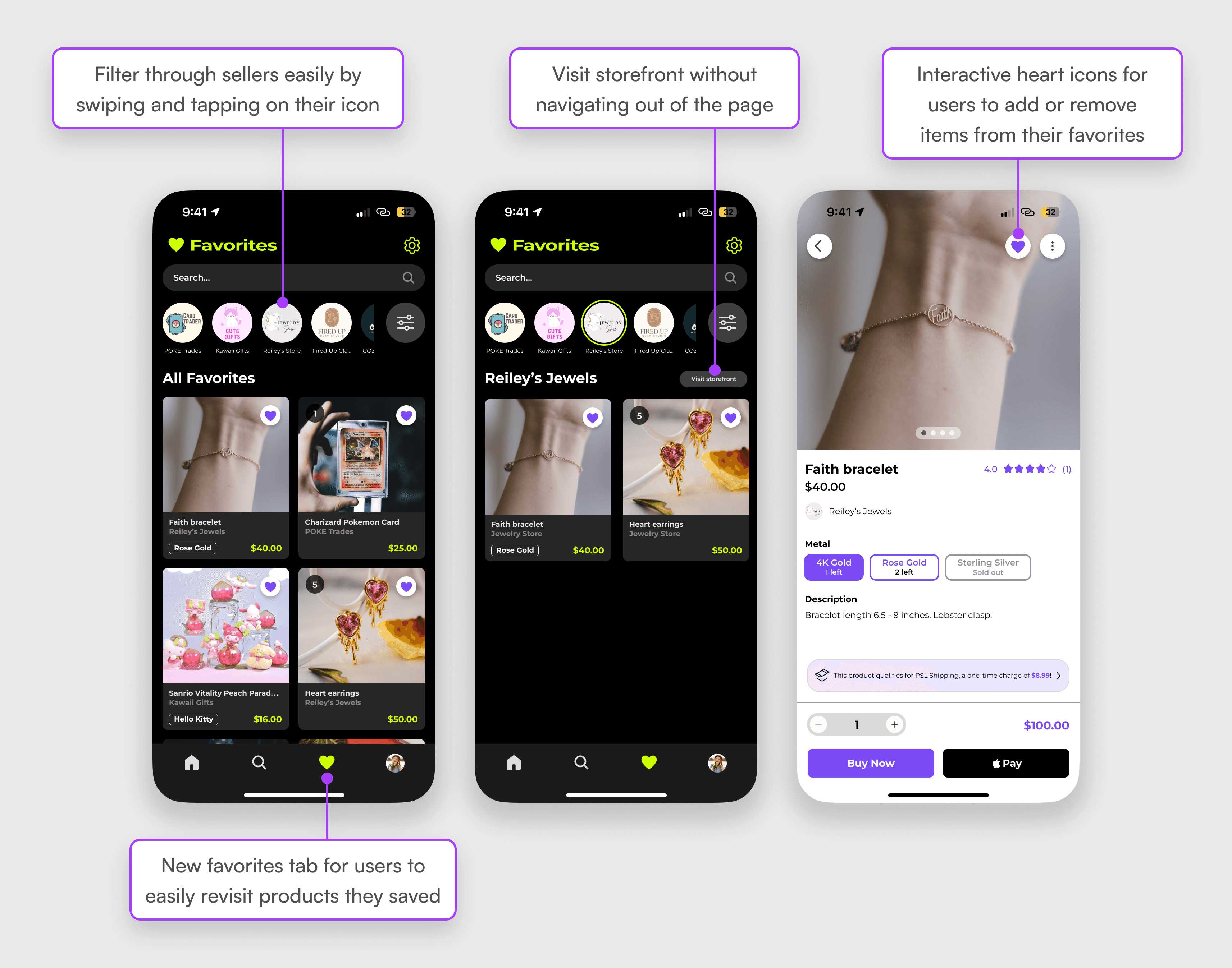
Users can save items to their favorites for easy access when they're ready to make a purchase.

Open Order Timer/Countdown

Open Order Timer /Countdown

Open Order Timer /Countdown

A way for users to know when their orders will close so they can make necessary decisions for their purchase.

User Flows

Now with two features in mind, I mapped out user flows that determined what path they can take to reach their goal. For the favorites feature, the goal was for users to successfully make a transaction from the favorites tab, whether in the same session or not. As for the open order timer/countdown, the goal was for users to simply check their order status any time after their transaction.

Favoriting and Purchasing

Checking open order countdown

Design

Low Fidelity Wireframes

I created low-fidelity wireframes using Procreate, developing three different designs for the Favorites tab and a concept for how the countdown timer would be presented in the app.

I conducted a short low-fidelity usability test to determine which design they preferred for the Favorites tab and assessed the effectiveness of the count down timer. Majority of participants liked the 3rd design since users have the option of seeing all their favorites on one screen or filtering them by seller. The countdown timer deemed effective because it creates transparency and urgency.

High Fidelity Wireframes

Favorites Tab

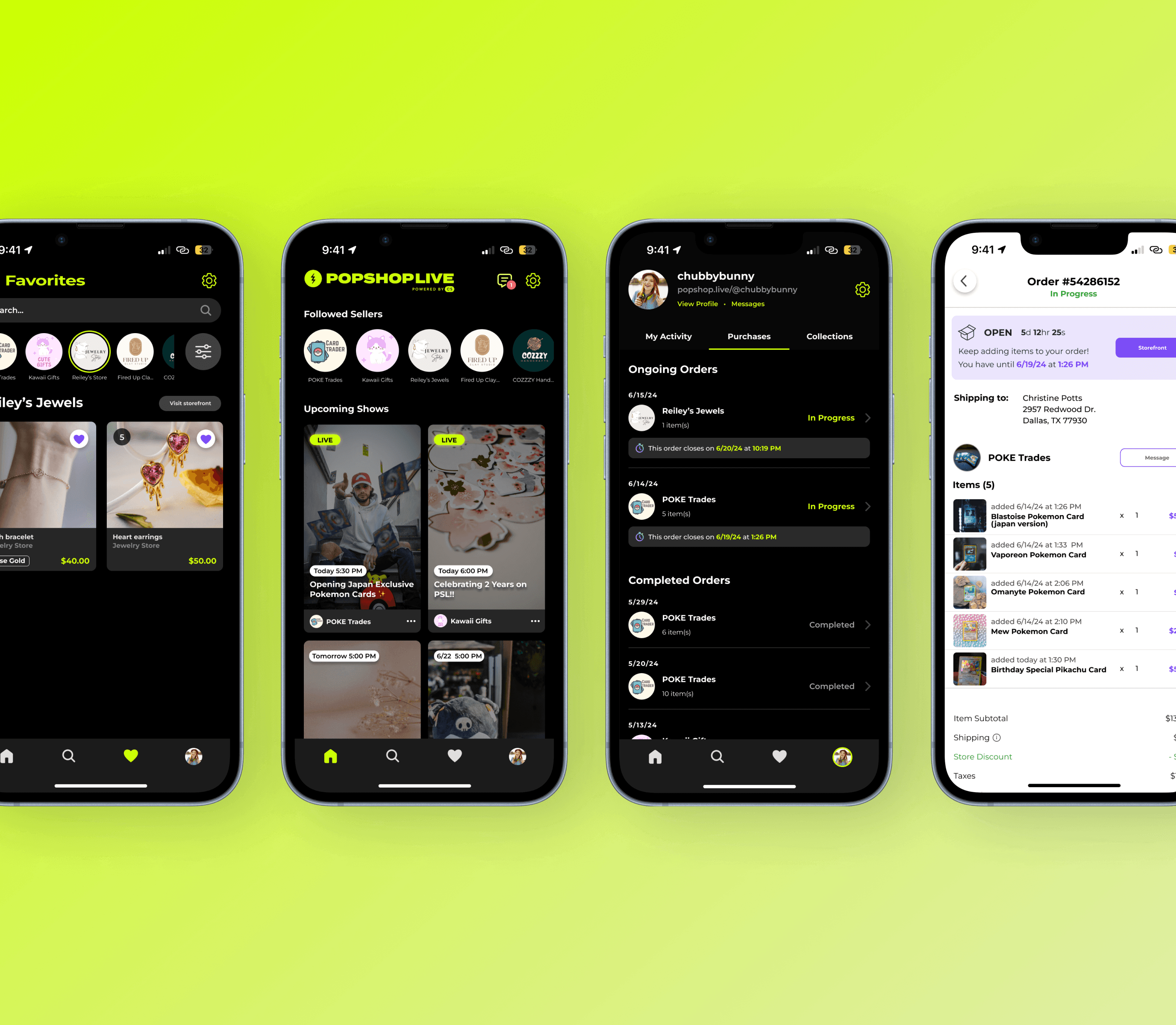
Users can favorite items and refer back to them in the favorites tab. All of their favorites will be shown by default but users can filter items by sellers by tapping the seller’s profile on top, making it easier to sift through. Each card shows the image of item, item price, item name, seller name, and the variant (if there is one) so users can easily be informed about the item they’re interested in. Upon tapping on the card, users can make adjustments to their variant if they wished, and begin their checkout process from there.

Countdown Timer

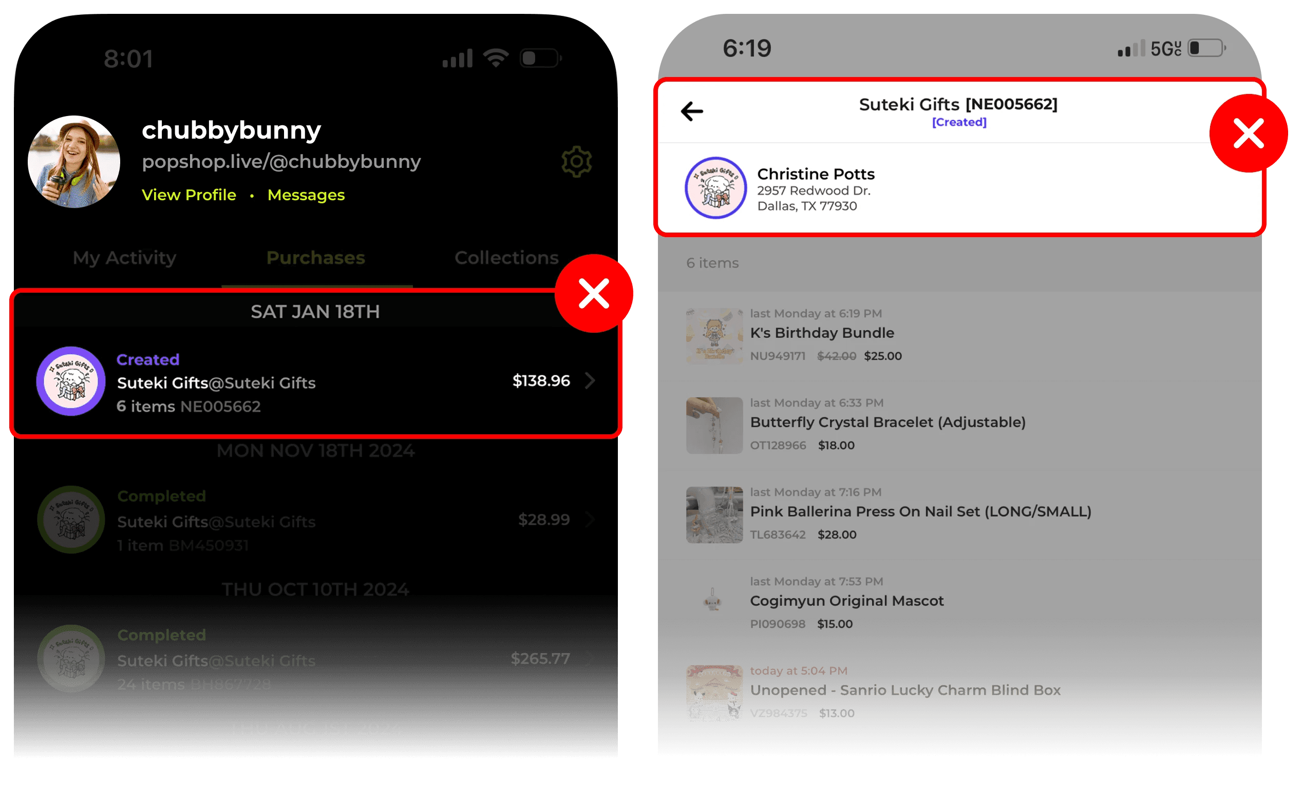
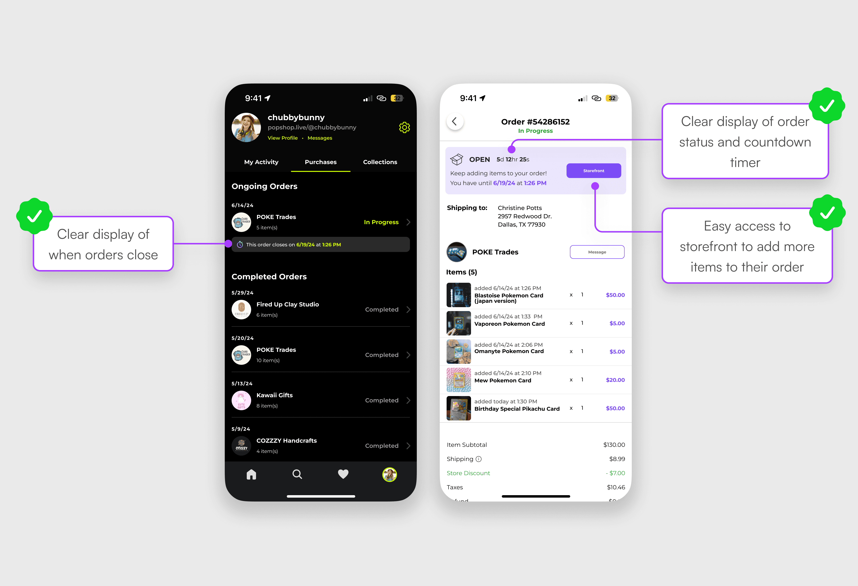
Each order has a countdown time displayed so users can easily see the day and time it closes. Order details will also have it displayed on top, with an addition of a “Storefront” CTA to easily access the seller’s storefront to buy more items. If the order has more than 24 hours left before it closes, the display will include the date and time; if the order is closing in less than 24 hours, a timer will be displayed instead.

Prototyping

High Fidelity Usability Tests

Participants: 5 participants

Type: Unmoderated remote testing via Lysnna

Tasks:

  1. Favoriting an item

  2. Purchasing the item via Favorites tab

  3. Checking order status

Objectives:

  • Assess users in how well they navigate favoriting an item and accessing it again to purchase it

  • Assess the usefulness of the close date/timer for users who already have an open order.

  • Identify any flaws and improvements in user flow

  • Validate how my designs compare to the current app

Positives

  • The favorites page was easy to use and users liked the filtering mechanism.

  • Users liked that active promotional deals were displayed during checkout which made it convenient to access and apply them.

  • All participants found the countdown timer very beneficial so they could make informed purchasing decisions.

  • Current PSL users praised how these thoughtful additions to the app could make a big difference in their user experience.

Improvements

  • Seller profiles were a bit small to see so users didn’t know where to go initially. It was recommended to also add their names on the bottom to make it more clear.

  • Instead of just saying “Your order has closed,” adding the date/time would be more informative, i.e. “Your order has closed as of 10/2/24

Iterations

Before

After

Bigger profiles + names

Before

After

Included date when order was complete and increased font size

High Fidelity Prototype

Click to see prototype ↴

Reflection

What I learned

As my first capstone project, I learned the importance of user-centered design in enhancing shopping experiences, especially in a livestream e-commerce platform where spending habits diverge from conventional online shopping. Because of how niche this type of platform is, it reinforced the importance of user research in understanding the needs and pain points of users to outshine close competitors. Working with an established brand also helped me recognize the inherent design constraints that UX designers encounter when integrating new features into an existing framework. This experience underscored the delicate balance between innovation and adherence to brand identity

What I could improve on

Asking the right questions. It wasn’t until after I started defining my problem and delving into the design process that I felt I could’ve asked more insightful questions that dug deeper into the user’s experience, which could’ve helped me create more impactful solutions.

Making adjustments in low-fidelity wireframes. After gaining user insights from low-fidelity usability tests, I went straight to making high-fidelity wireframes without refining my low-fidelity wireframes to check if those adjustments were feasible, which in turn made me less efficient creating high-fidelity wireframes.