Overview
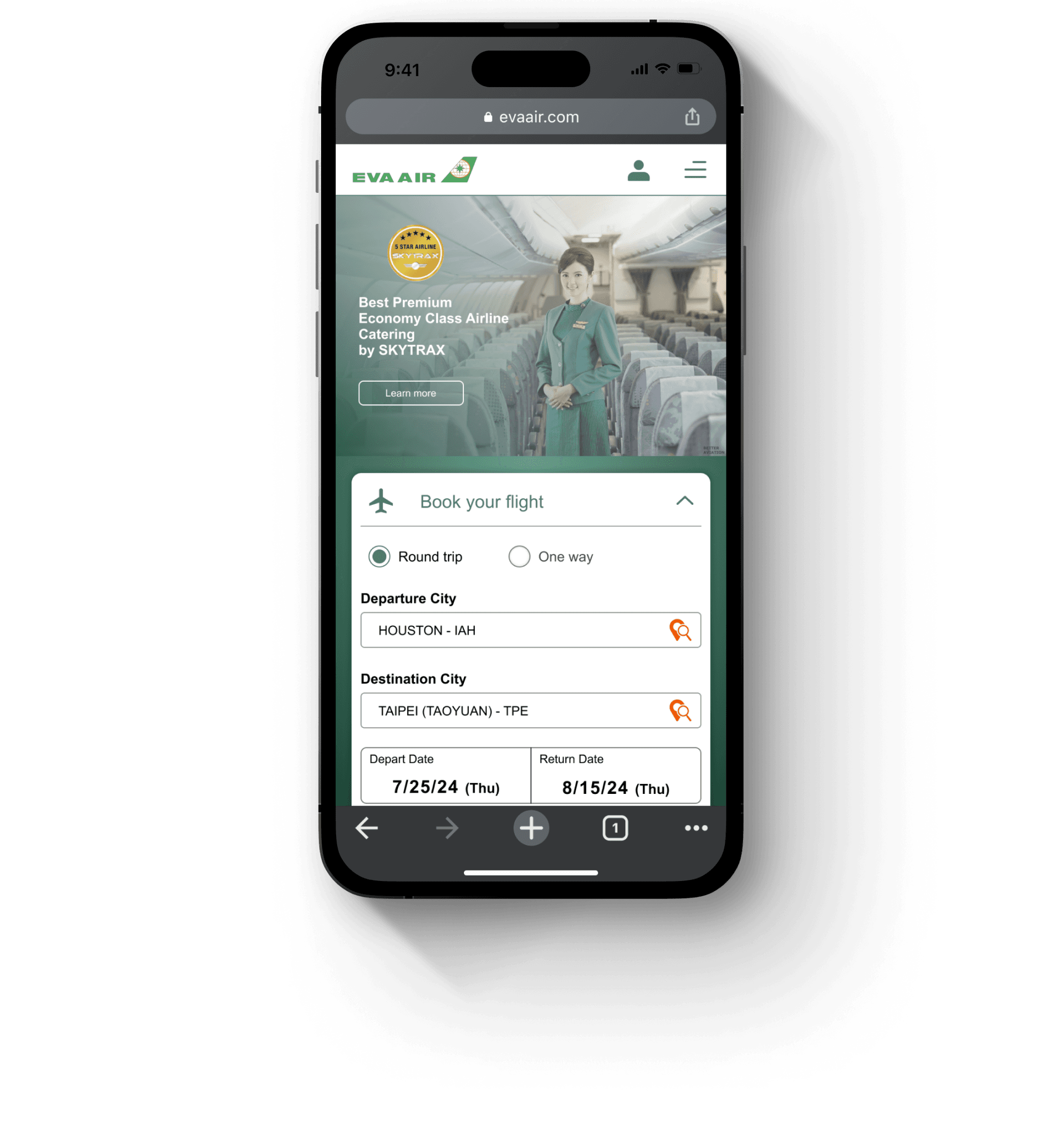
The objective of this student project was to create, re-imagine, or iterate upon a responsive set of flows for a new travel site. I chose to focus on EVA Air, streamlining its booking process and improving their visual design to enhance user experience and satisfaction. By implementing a more intuitive navigation structure and visually appealing layouts, the goal was to reduce user frustration during the booking journey, making it easier for travelers to find flights, explore services, and access essential information.
Research
Given the competitive nature of the airline industry, it was essential to analyze how a streamlined and intuitive design could improve customer satisfaction and as well as attract new users. Airline websites provide a plethora of information and lots of interactive features that make user research critical in creating an optimal website. Thus, I wanted to learn what international flyers expect when booking their flights and discover what issues EVA Air patrons encounter so I can redesign EVA Air’s website to better meet user needs.
Objectives
Understand specific needs and expectations when booking flights
Discover common challenges that current EVA Air flyers experience
Assess user habits when searching for flights
Research Method
User interviews
I interviewed 5 participants who booked flights through an international airline, 3 of those participants have flown with EVA Air. I wanted to understand how they felt about the flow and design of the booking process, and how it compares to other airlines they’ve flown with. Other airlines participants have flown with include, KLM, China Airlines, and United.
EVA Air patrons feel that the booking process has way too much unnecessary information scattered everywhere, from how costs are calculated to policies about meal services all in one text box.
Too many interactions that make the site feel clunky and slow.
Especially in the flight selection page where there’s a lot of information, users like it organized in cards or a grid system so the information is easily digestible.
Competitive analysis
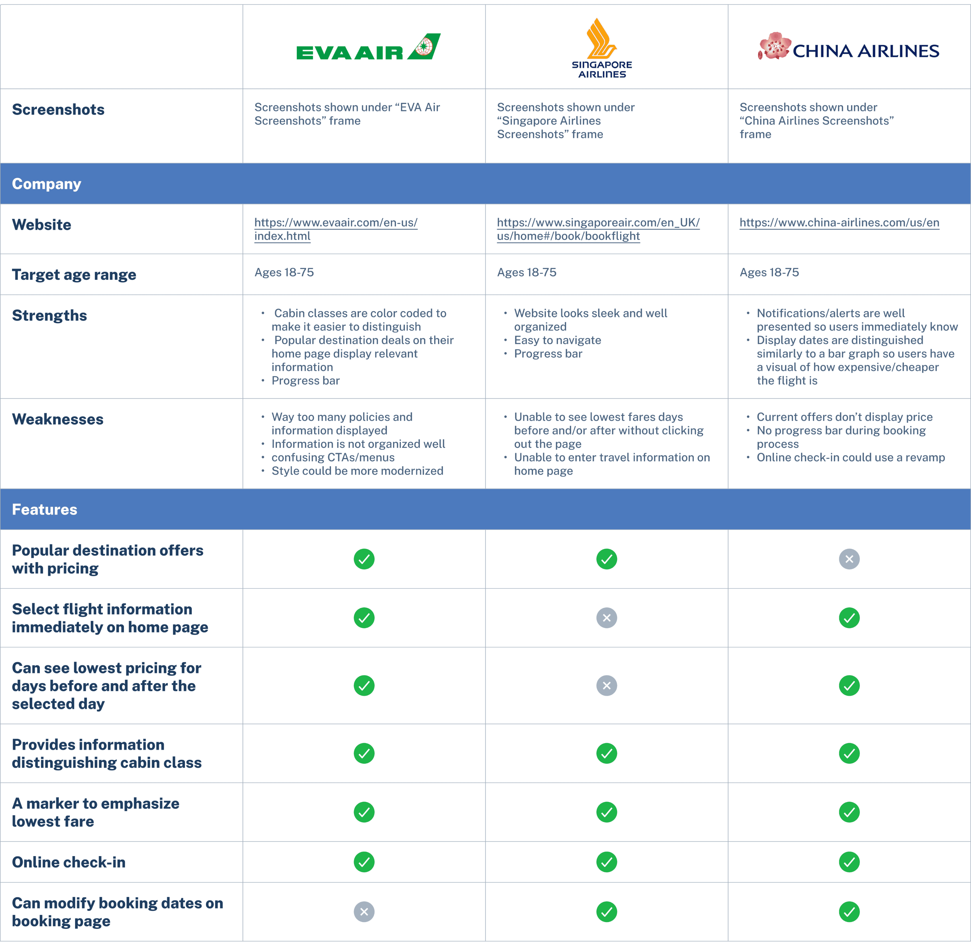
I compared EVA Air with 2 other international airlines: China Airlines (a close competitor also from Taiwan), and Singapore Airlines. I went through each airline’s website to experience their booking process so I could have a thorough understanding of how each performed. I noted strengths, weaknesses, and different features as a way to compare all three airlines.
💡 So, what did I learn from my research?
While the website is able to complete user tasks, the website can use some updates with their design and aesthetic to attract users to keep flying with EVA.
Improvements can be made in visual hierarchy and layout. A lot of information about how costs are calculated and airline information that users have stated wouldn’t matter to them or even read.
Cabin classes can be hard to understand, users like concise descriptions for each.
No complaints with inputting personal information but minor design updates can help user experience flow.
Define
The question is:
How might we improve the visual hierarchy and design of EVA Air’s website so that users can better navigate the page and have a pleasant experience booking their flight?
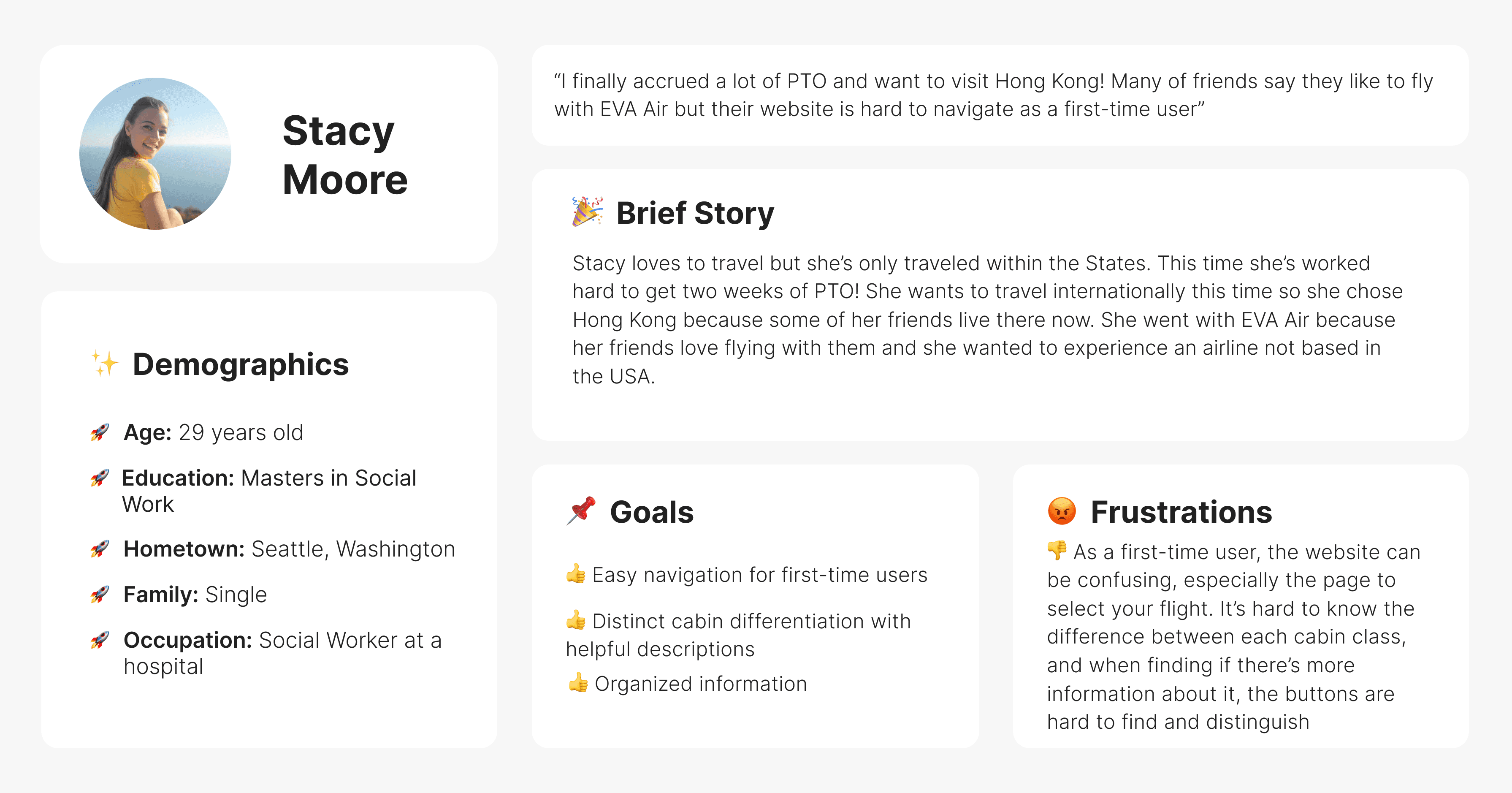
User Personas
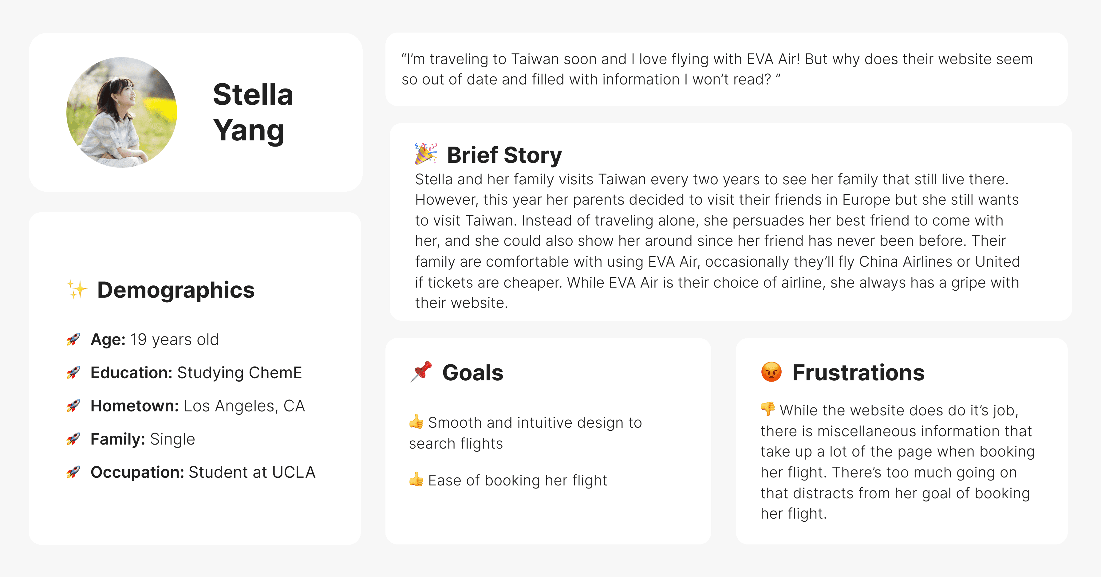
By creating user personas, I found the main points to focus on when redesigning EVA’s website. First is reorganizing the fight selection page so information is clearly displayed and digestible. Second is reformatting the cabin class selections so users don’t need to fixate on so many interactions. Third is organizing forms and itinerary to allow seamless user input and readability.
User flow for booking flights
Design
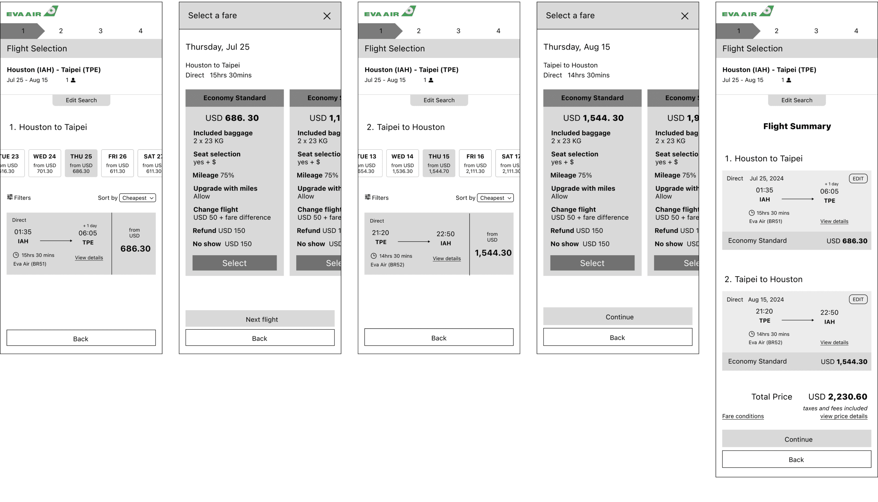
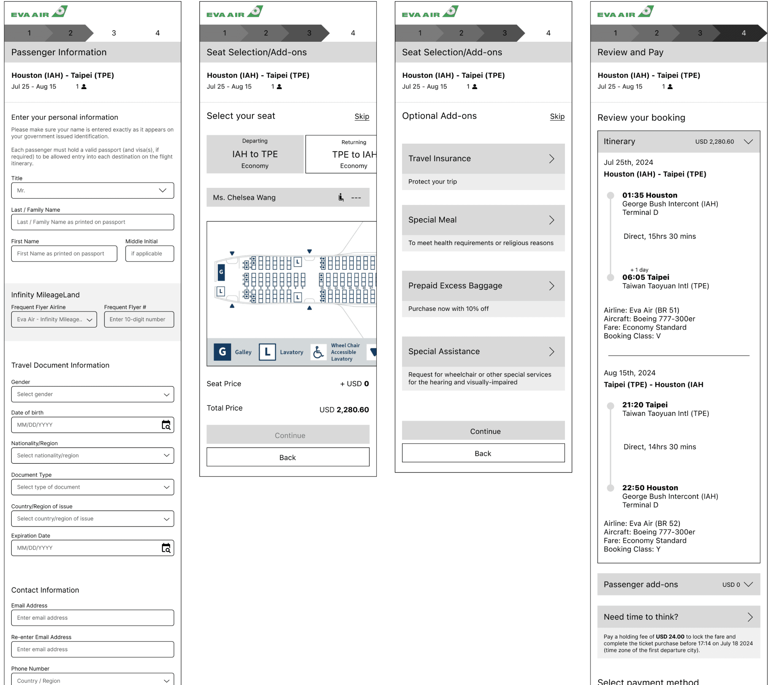
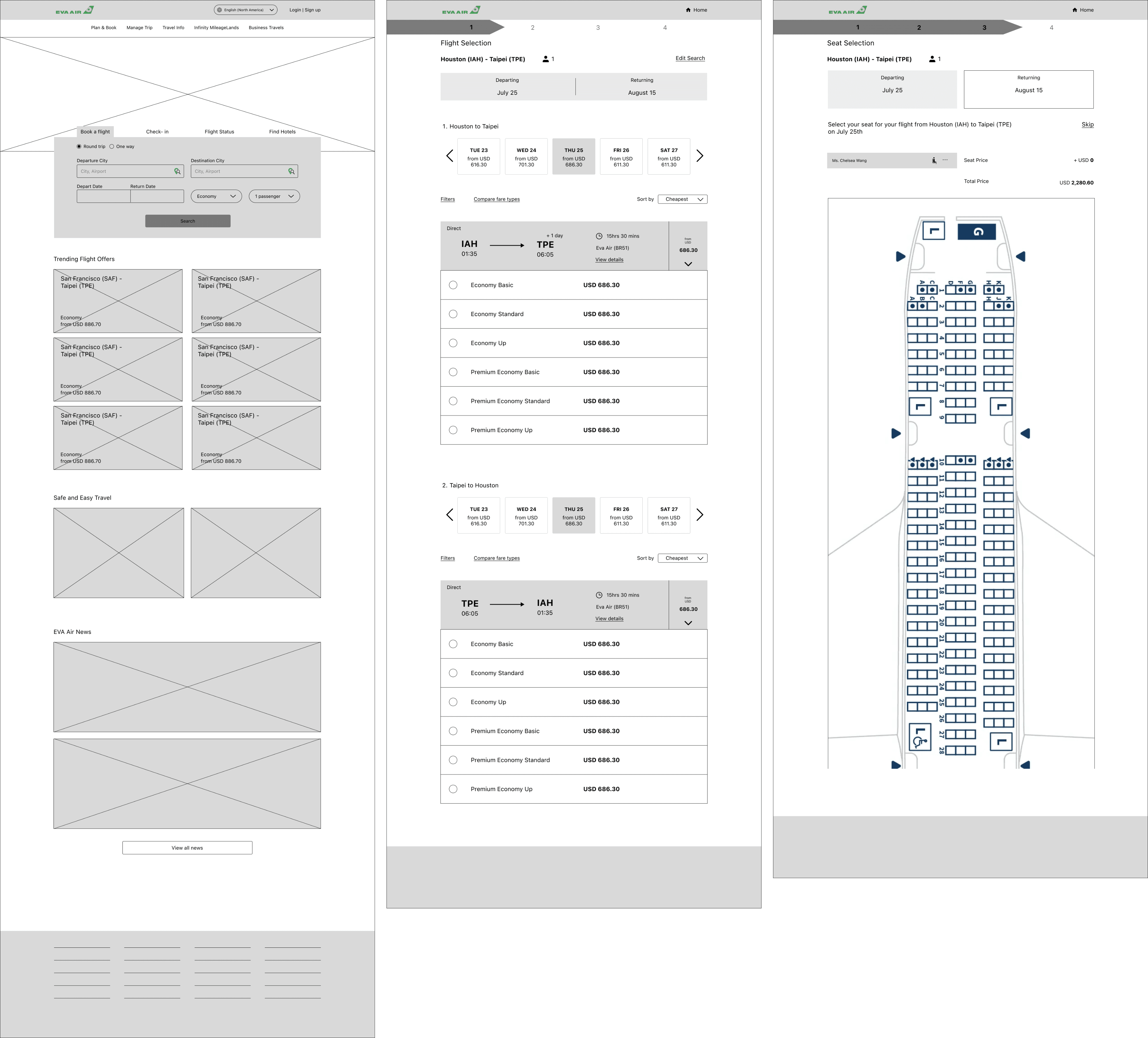
Low/Mid Fidelity Wireframes
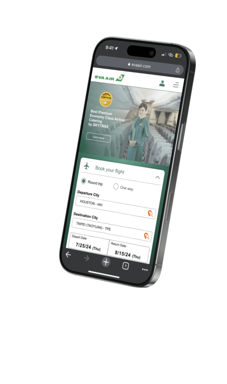
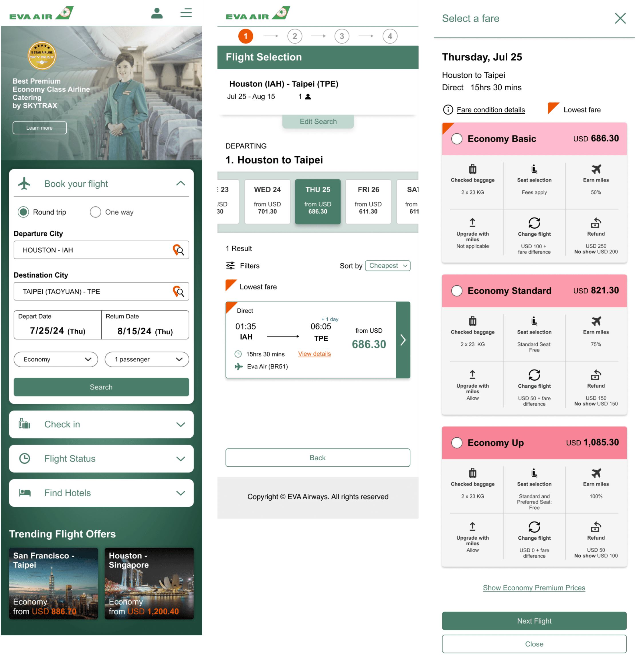
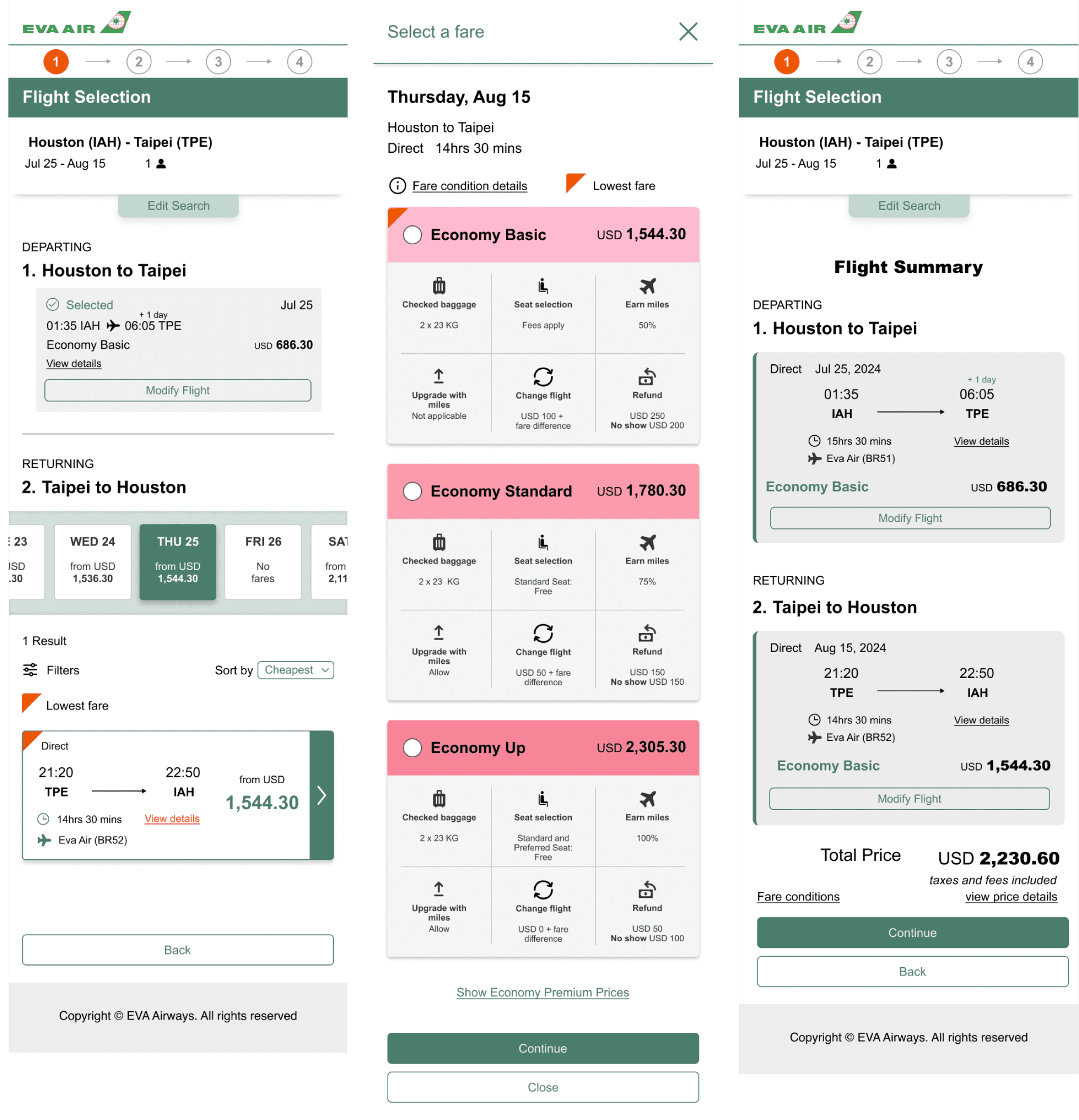
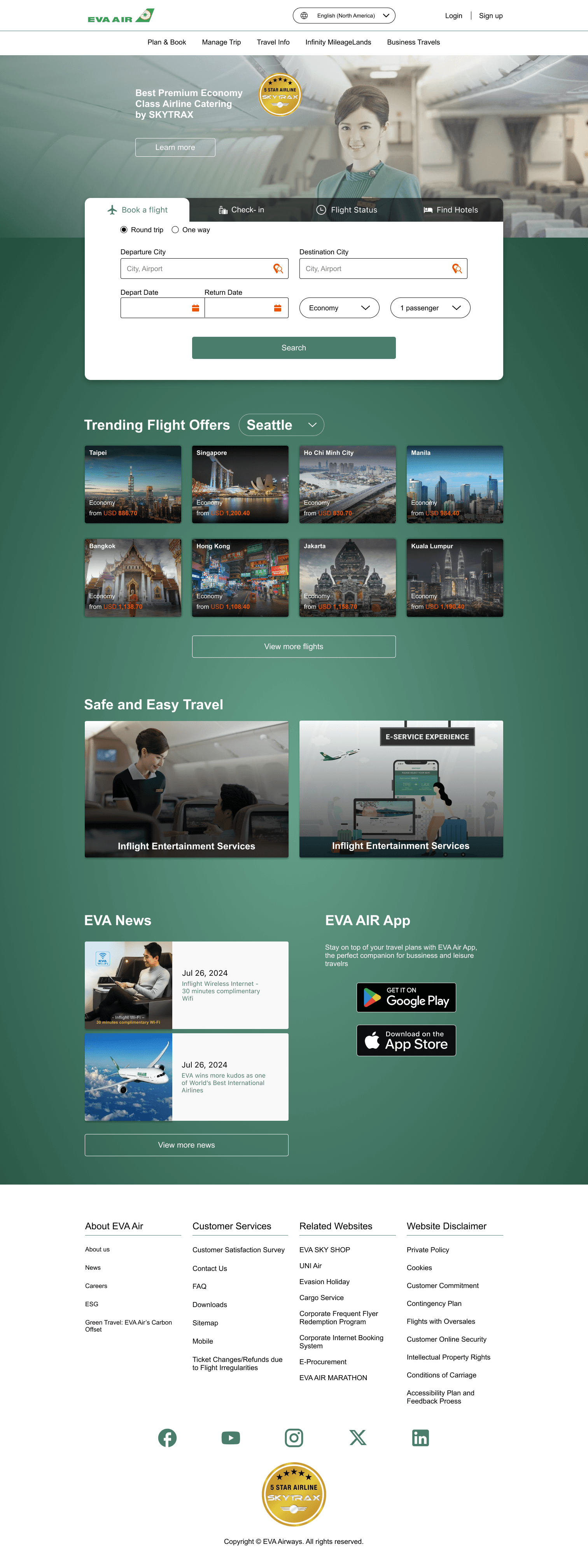
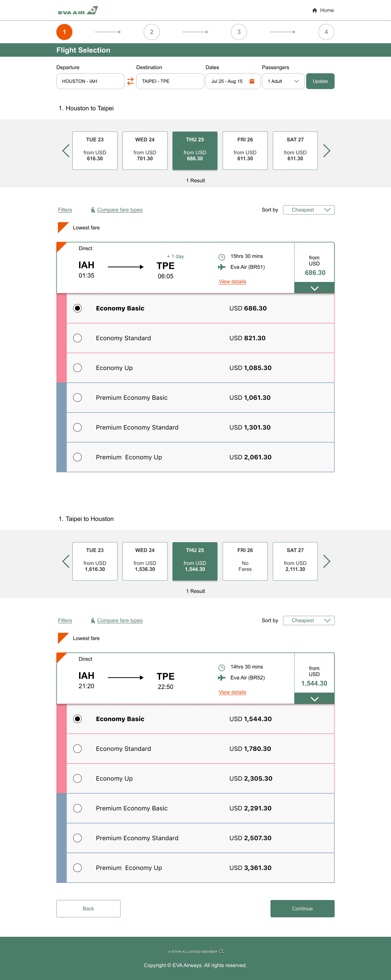
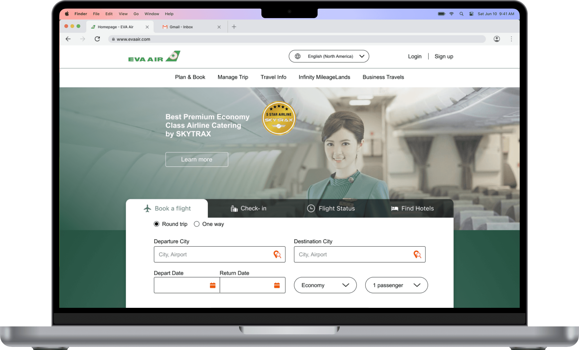
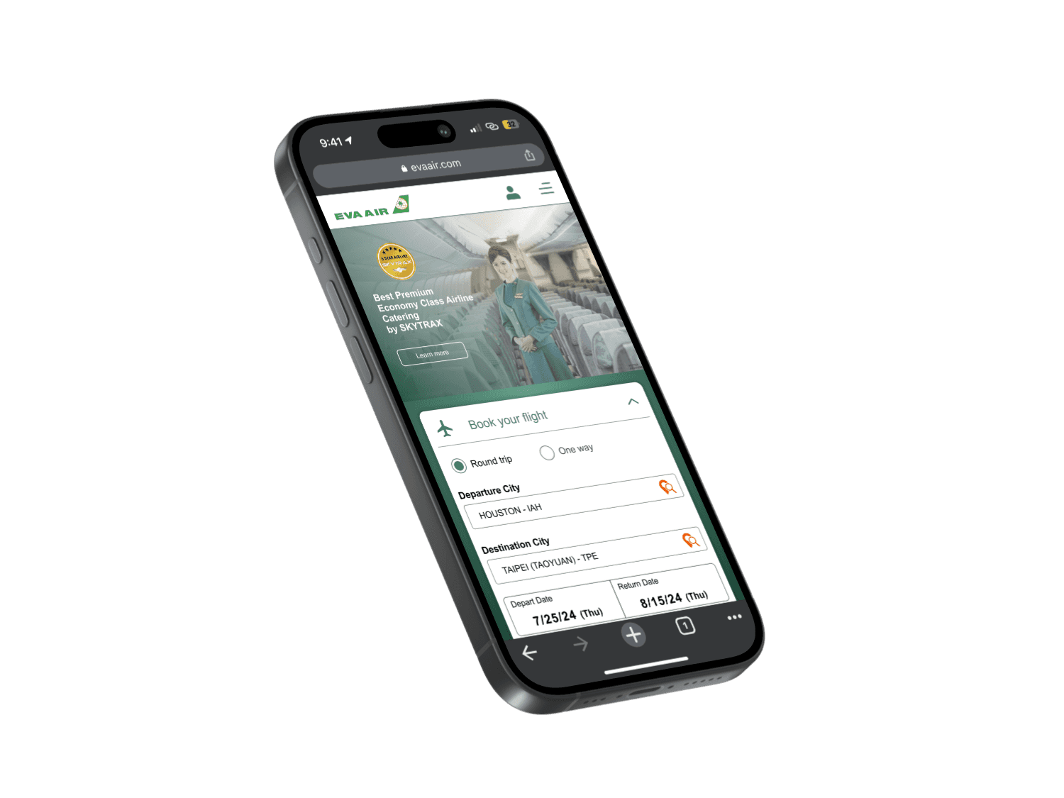
I created low-fidelity wireframes for the entire booking process for both mobile and desktop, from flight selection to itinerary. I wanted to keep the design familiar but intuitive.
Mobile
Desktop
High Fidelity Wireframes
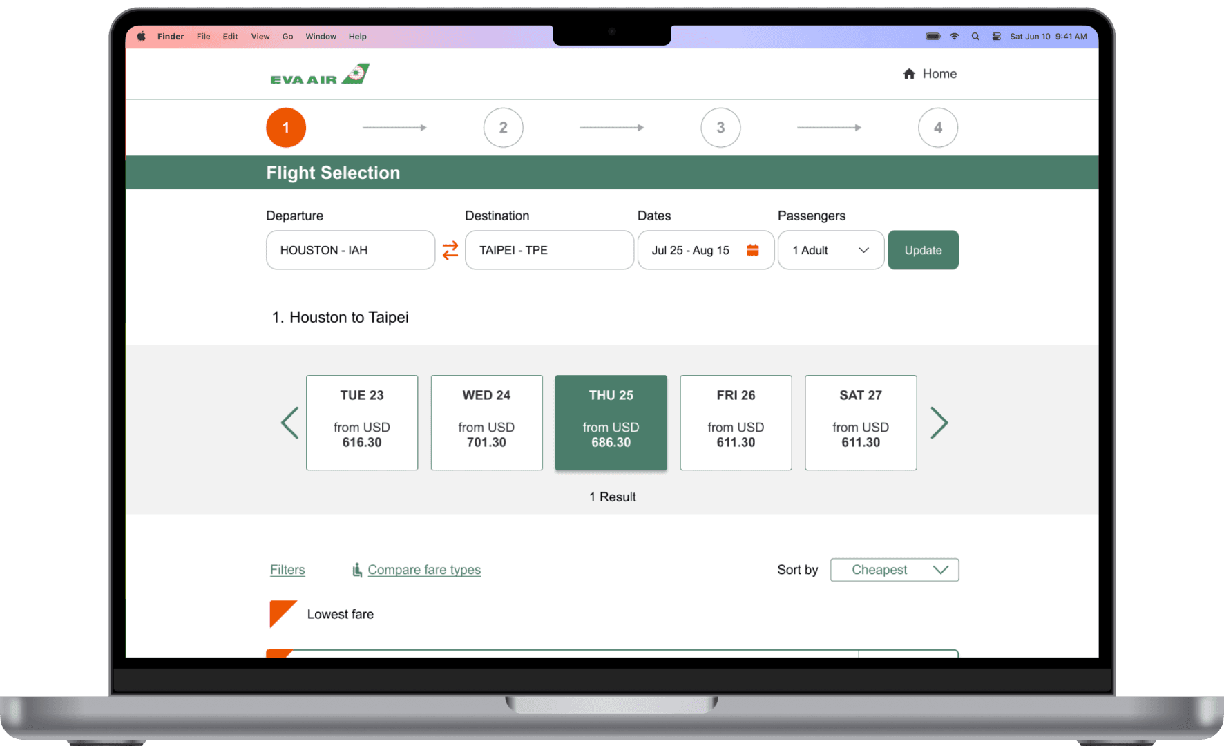
The high-fidelity wireframes for booking a flight with EVA Air present a detailed and polished user interface designed to enhance the booking experience. These wireframes feature a clean and modern layout that reflects the airline's branding, with an emphasis on clarity and usability.
Flight Selection
Flight details and essential information are presented clearly, ensuring that users can easily select their preferred flights without being distracted by unnecessary information. I utilized EVA Air's color palette and gradients to effectively differentiate between class options.
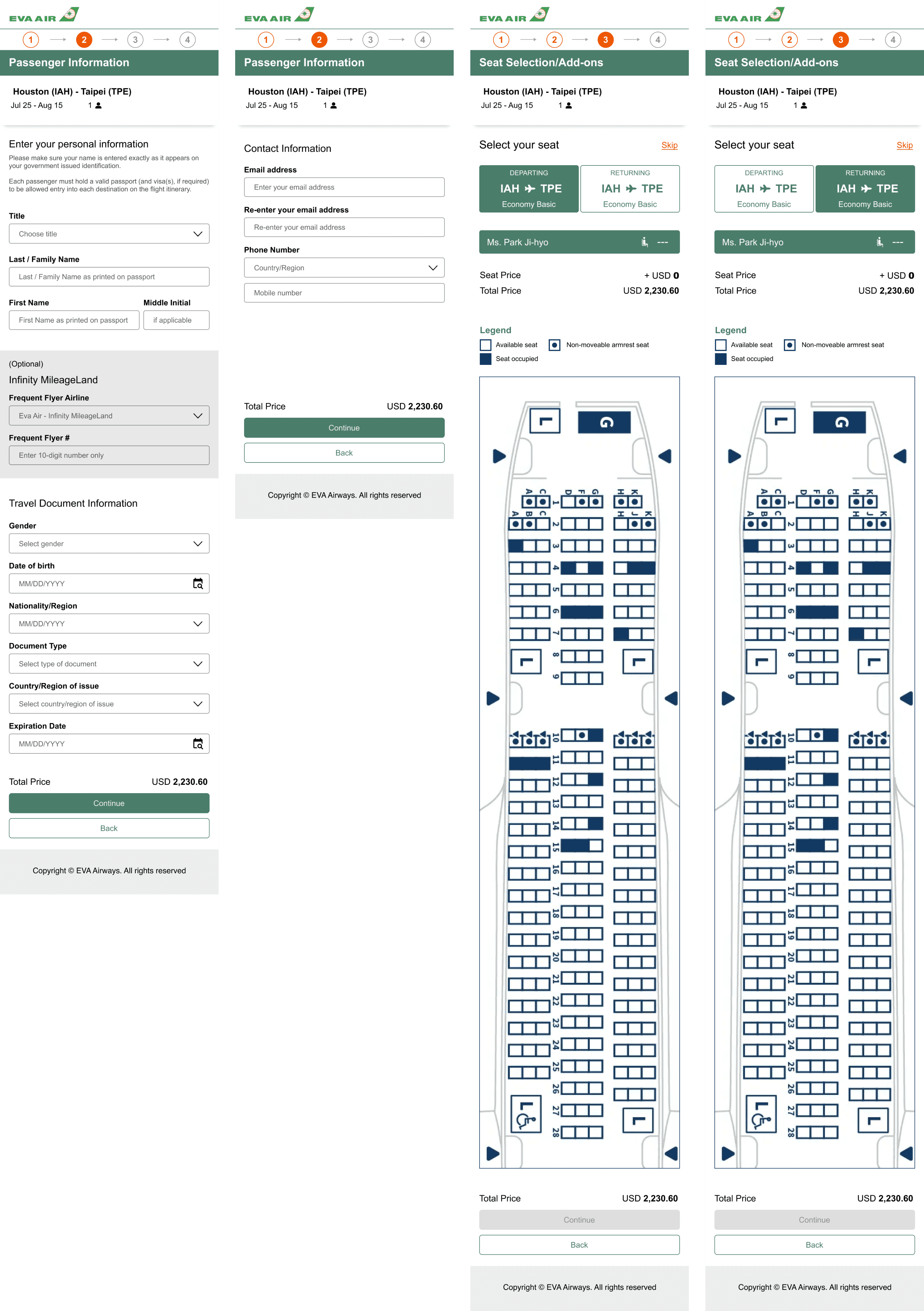
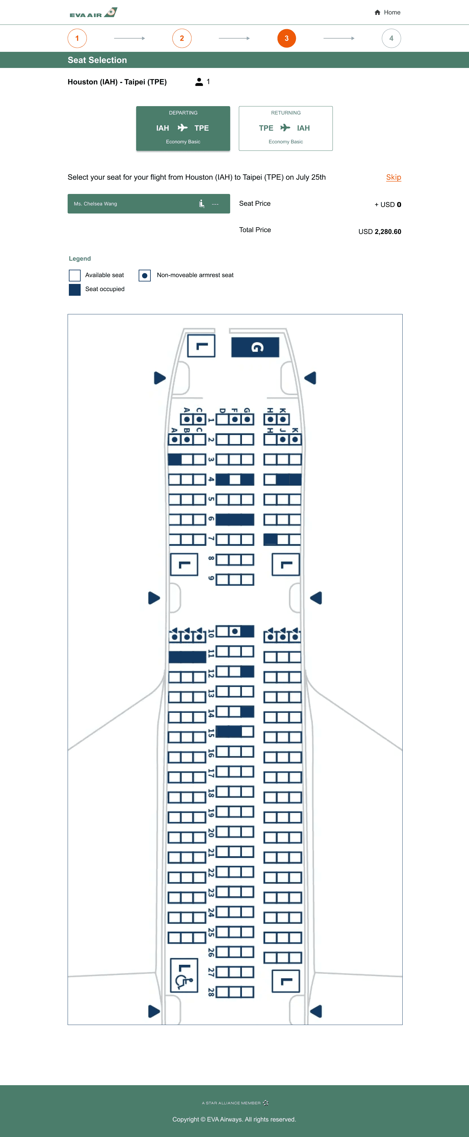
Personal Information + Seat Selection
Keeping consistent IA and UI elements to convey reliability and foster user confidence so they develop familiarity and trust in the system. This cohesive design approach not only enhances usability but also reinforces the brand’s professionalism, ultimately leading to a more satisfying and reassuring experience for users as they engage with the site.
Prototyping
High Fidelity Usability Tests
Participants: 5 participants
Type: Unmoderated remote testing via Lysnna + in-person testing
Tasks:
Selecting flight
Entering personal information
Review flight
Objectives:
Assess effectiveness of new IA and UI elements
Evaluate how well users navigate through booking their flight
Determine any areas where users encounter difficulties or frustrations during the booking process
Positives
Information is well-organized and easy to understand
The added icons were helpful to differentiate information between compartments when selecting a cabin class
Users who have booked through EVA Air praised the sleek design and smooth flow
Improvements
Instead of using a gradient to differentiate between tiers, just use one color so it’s not confusing and it looks more uniform
Iterations
Per user feedback, I chose to keep cards all the same color to keep it visually less busy and maintain uniformity. The radio button was removed, instead the outline of the card will show once selected. The “Next Flight” CTA was moved up with the card upon user selection for easy access.
Before
After
High Fidelity Prototype
Click to see prototype ↴
Reflection
What I learned
I gained invaluable insights into the complexities of designing a user-centered travel booking experience. This project allowed me to explore the nuances of visual hierarchy, and interface design while focusing on the unique needs of international flyers. Through user research, I discovered specific challenges users faced when navigating the existing website, which informed my design decisions. This not only improved my problem-solving skills but also reinforced the significance of incorporating user feedback throughout the design process. Additionally, I learned how crucial it is to maintain a cohesive and consistent design language. By implementing uniform UI elements and a clear informational layout, I aimed to create an environment that fosters trust and enhances usability.
What I could improve on
Invest more time in developing low-fidelity wireframes, as refining them early on can significantly reduce the amount of time needed for adjustments in high-fidelity wireframes later in the process.

